Rescuing The Failed Work
Sometimes you create a thing, and the thing is DECIDEDLY WRONG.
And sometimes you can SEE RIGHT THERE what is wrong.
Sometimes you can fix it. And sometimes you cannot.
I have paintings that have a flaw, that I cannot fix. I have the SKILL to fix it, and I have the knowledge of what is wrong.
But when you finish a painting, and clean up the paints, it is often really scary to go back again to correct something. It is HARD to get the paints mixed right, and if they are wrong, the correction might just be WORSE than the flaw you are trying to correct.
More times than I can recall, I have chosen NOT to repair a flaw, because the risk that I will completely destroy the painting is so great I just can’t make myself do it.
Sometimes though, it can be done. It isn’t always worth it with a really bad flop, but often it is.
Corrections, it seems, are full of “sometimes”.
I spend part of yesterday correcting two paintings. One had glitter glue that ran into the wrong area, so I had to paint over it, and then re-glitter it. Easy enough if I can match the paints and the glue, and I could, well enough.
The other required some creative modifications. It is BETTER, but not sufficient. I shall have to correct it again. This one also has glitter. So I need to paint, and then glitter. If I can get the color right.
One more waits, and it is a major undertaking. Matching the colors is only part of the equation, and I could entirely ruin it by trying. But it is not a work that has value as it is, so correcting it is the only thing I can do. The risk MUST be taken.
Meanwhile two half-finished paintings with oceans in the middle, and seashell framing are waiting to be finished. So I struggle to balance the time. Correct the old, or finish the new?
And how can I just do both?
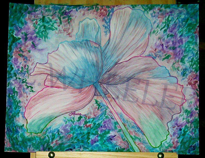
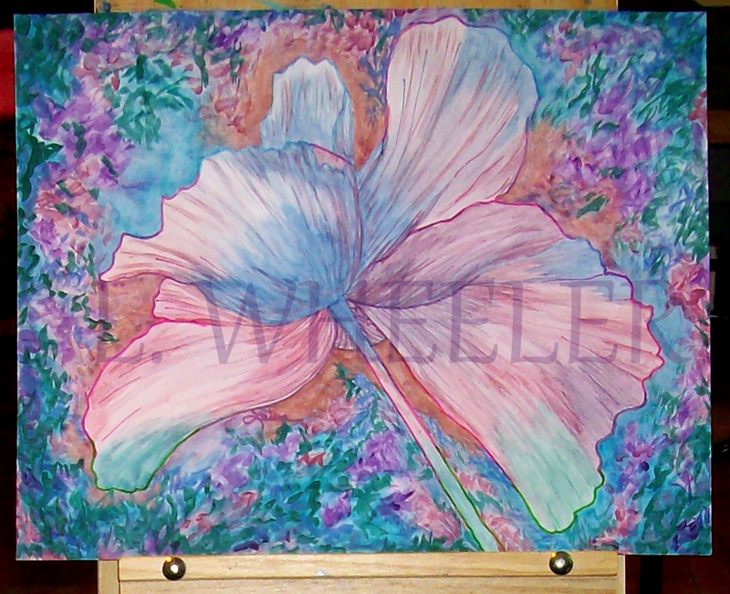
This painting just did not make much sense, because you cannot see the outline of the flower well enough to differentiate it from the background. I feared touching it up, because I was afraid I could not match the colors.
Gave it a try anyway, and failed utterly to match the warm reddish tones of the original colors. The color I used is a bit too orange. Fears realized. Not sure if the painting is better, or worse. But you CAN see that it is a flower, even at some distance. The color difference otherwise, between the two, is just camera color issues.


